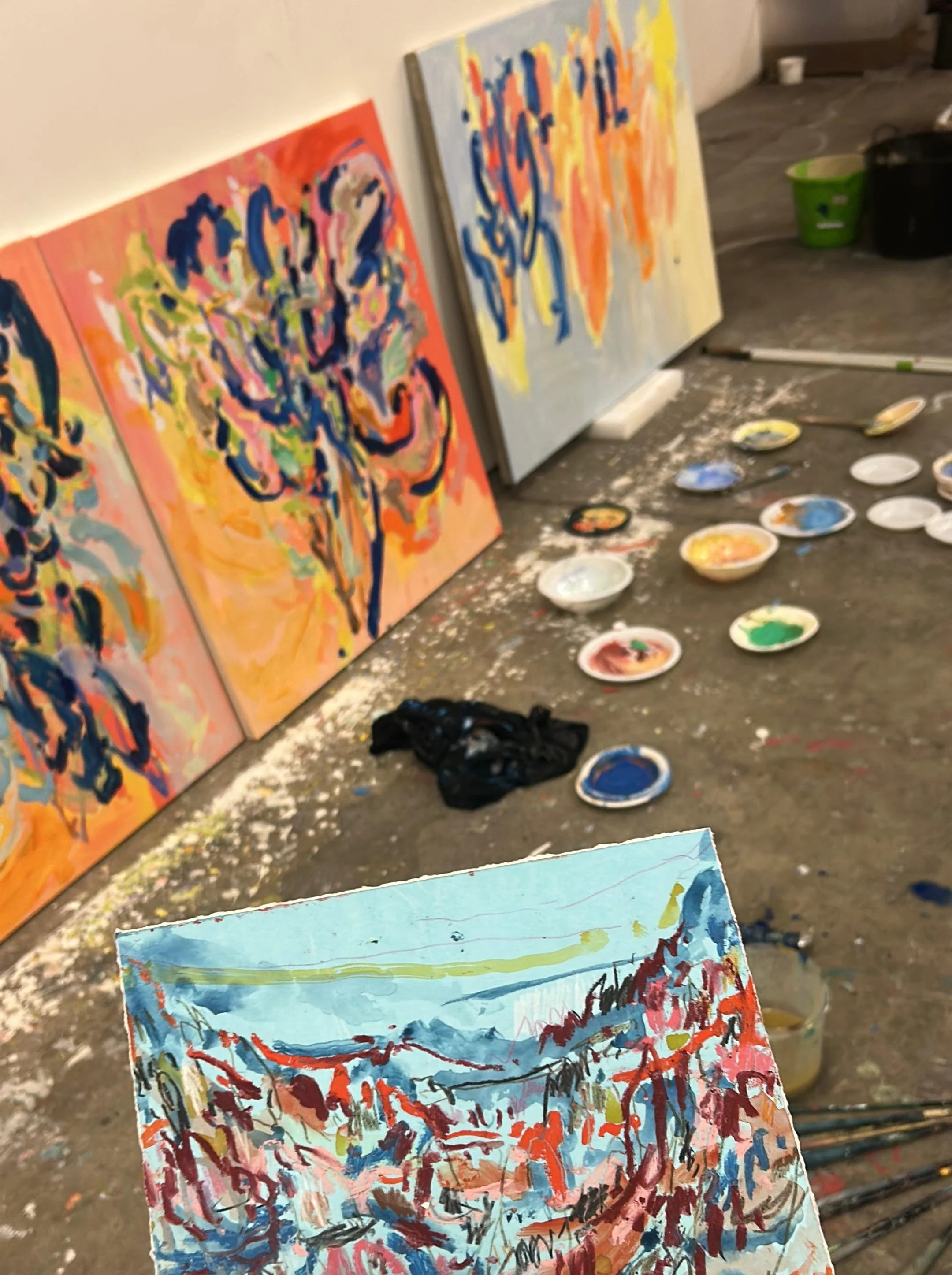
The Language of Colour in Art: From Symbolism to Bold Palettes
Colour in art is more than just a visual choice. It is a language. Across centuries, artists have used colour to tell stories, spark emotion, and shape how we see the world. From the sacred blues of Renaissance altarpieces to Van Gogh’s glowing yellows and Rothko’s meditative reds, colour carries meaning that goes beyond the canvas. When we understand this language, bold palettes stop being decorative and instead reveal layers of history, culture, and feeling.
In this article, we explore how artists from different periods have approached colour. From Renaissance symbolism to modern abstraction, colour has always been central to how we experience art.
The Symbolism of Colour in Art
Colour has long carried symbolic weight. In medieval Christian art, gold backgrounds were used to show the divine. Blue, particularly ultramarine, was often reserved for depictions of the Virgin Mary because it was rare and costly. Red signified power, martyrdom, or divine love.

In Giotto’s The Lamentation (c. 1305), part of the Scrovegni Chapel frescoes in Padua, a deep lapis blue dominates the sky and the Virgin’s robe, both symbolising the divine and drawing the viewer’s gaze to the emotional centre of the scene. The precious pigment underscores Mary’s sacred importance, while its contrast against muted earth tones highlights the figures of Christ and his mourners. Giotto’s handling of colour marked a shift from the flat, decorative hues of medieval art toward a more naturalistic and expressive use of tone, creating depth, volume, and emotional resonance. Here, colour is not mere ornament but a narrative force, intensifying grief and bringing the sacred story closer to human experience.
This early use of colour shows us that palettes are not random choices. They reflect cultural values, material availability, and the spiritual messages of the time.
Bold Colour in the Renaissance and Baroque
By the Renaissance, artists placed increasing emphasis on naturalism, carefully observing the effects of light and texture. Yet colour still retained deep symbolic and emotional power. In Titian’s Venus of Urbino (1538), tthe rich reds of the bedspread, cushions, and drapery dominate the composition, infusing the scene with warmth and overt sensuality. These tones do not simply decorate; they heighten the erotic charge of the reclining Venus, suggesting passion and desire. Against this intensity, Titian set the cooler, luminous tones of Venus’s skin, producing a striking visual tension that elevates her presence. The harmony of flesh against fabric creates both contrast and balance, guiding the eye to the figure’s calm, self-possessed gaze. In doing so, Titian demonstrates how colour could move beyond symbolism alone to become an active agent in constructing mood, meaning, and psychological depth.

In Titian’s Venus of Urbino (1538), colour plays a central role in shaping the painting’s emotional power. The deep reds of the cushions and drapery radiate warmth and passion, signalling themes of love and desire. These rich tones wrap the scene in sensuality, while also guiding the eye across the reclining figure. Against this intensity, the cool, pale tones of Venus’s skin stand out in striking contrast. The effect is deliberate: her body becomes the calm centre of the composition, serene and luminous. This balance between warmth and coolness adds depth to the image and builds a subtle tension between desire and purity. Titian’s use of colour here is not only symbolic but also psychological. He shows how carefully chosen hues can influence the mood of a painting, drawing viewers into an intimate encounter that feels both immediate and timeless.

Through these examples, we see that bold palettes can mean drama, desire, or divine revelation.
The Emotional Power of Colour in Modern Art
With the rise of Impressionism, colour began to break free from strict realism. Claude Monet painted the same subject under different light conditions, showing how colour shifts with time and atmosphere. His series Haystacks (1890–91) is a study in how colour transforms perception.

Vincent van Gogh pushed the expressive use of colour further than many of his contemporaries. In The Starry Night (1889) the sky twists and swirls with saturated yellows and deep blues, creating a sense of turbulence and movement. The tones are bold and exaggerated, not chosen to match nature but to capture an inner world of feeling. Van Gogh believed that colour could carry emotion more strongly than form or subject. The glowing yellow stars seem alive, almost vibrating against the cool, restless night sky. Together, they create a mood that feels both hopeful and troubled. Through this approach, Van Gogh showed that colour in art could become a language of the soul, capable of expressing intensity far beyond what realism could convey.

This emotional approach to colour influenced Expressionism and Fauvism. Henri Matisse’s The Red Studio (1911) flattens space into a single bold red, turning the room into a psychological, almost dreamlike environment.

In these works, colour becomes the emotion itself.
Abstract Colour: From Kandinsky to Rothko
In the 20th century, abstraction brought colour to the very heart of artistic expression. Wassily Kandinsky believed that colour could act like music, creating emotional vibrations in the soul. In Composition VII (1913), swirling blues, fiery reds, and glowing yellows collide in a visual symphony. Each hue feels alive, as if it were a musical note rising and falling across the canvas. Kandinsky often spoke of painting as an act of listening—he believed colours had sounds, moods, and spiritual frequencies. Rather than describing the world, his work aimed to awaken something internal and intuitive in the viewer. This marked a turning point in the history of art, when colour was no longer a tool for depiction but a direct language of emotion and energy.

Later, Mark Rothko used vast fields of colour to create meditative experiences. In works such as Orange and Yellow (1956), the soft edges and luminous tones invite contemplation. Standing before a Rothko canvas, viewers often describe feeling absorbed, even overwhelmed.

Colour in Contemporary Art
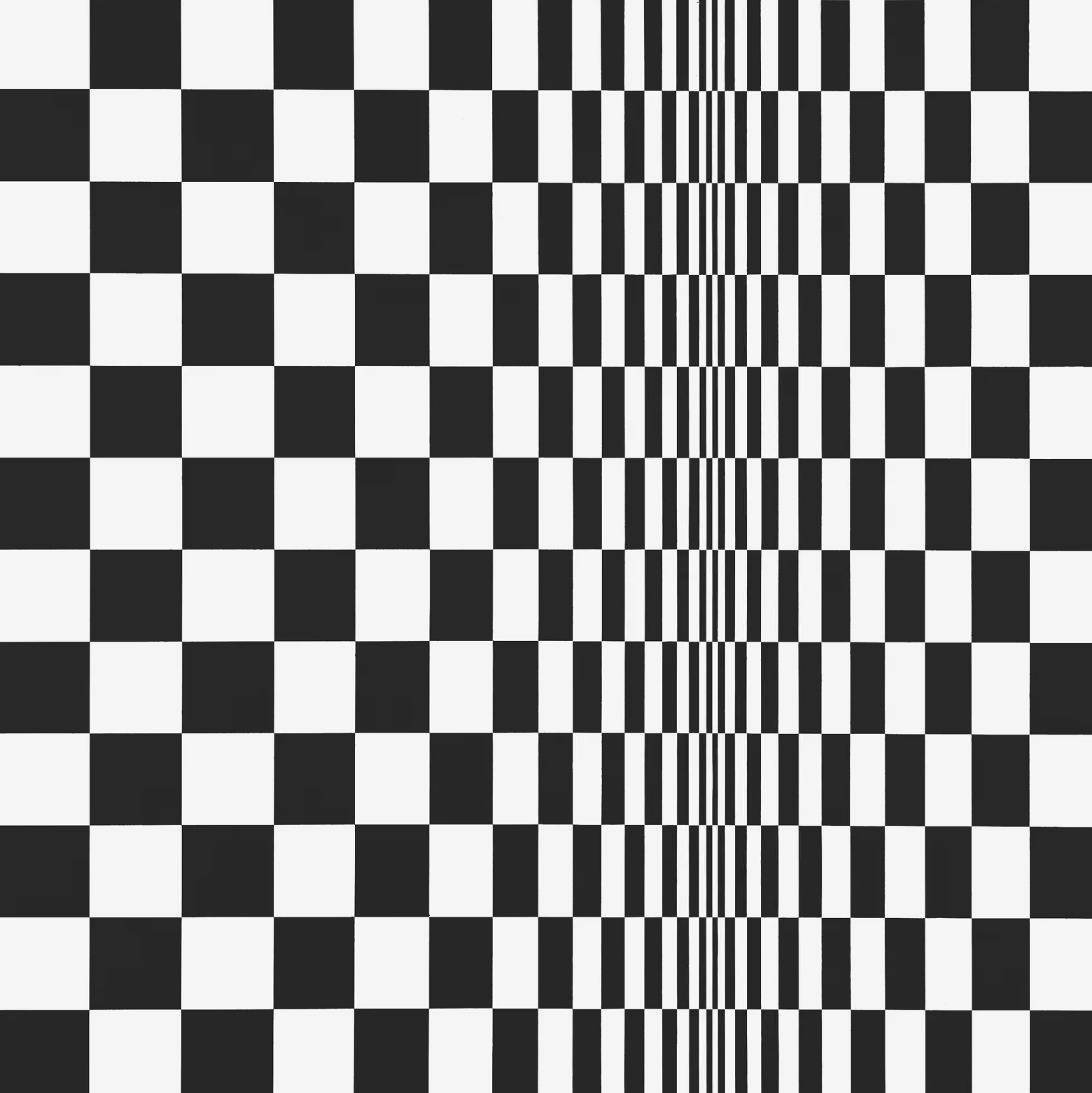
British painter Bridget Riley, one of the leading figures of the Op Art movement, shows how colour can be used to trick the eye and activate perception. In works like Movement in Squares (1961), she relied on stark black and white contrasts to explore spatial tension. Through subtle shifts in tone and hue, Riley created visual vibrations that make the canvas feel alive, reminding us that colour itself can move.
Japanese artist Yayoi Kusama takes colour into an entirely different realm—immersive environments. Her iconic polka-dot installations and mirrored infinity rooms envelop the viewer in glowing hues. Works like Infinity Mirrored Room – Filled with the Brilliance of Life (2011) use colour not just as paint or surface but as atmosphere, expanding the viewer’s sense of space and even dissolving boundaries between self and artwork. Kusama’s bold palettes become both playful and cosmic, capturing joy while hinting at infinity.

Meanwhile, American painter Kehinde Wiley reimagines colour as a political and cultural tool. Known for his portraits of Black sitters placed within ornate, patterned backgrounds, Wiley merges the tradition of Old Master painting with bold, contemporary palettes. His work—such as Napoleon Leading the Army over the Alps (2005)—juxtaposes classical poses with vivid floral motifs and bright colours, reframing power and identity. Colour here is not neutral; it is confrontational, celebratory, and unapologetically bold.

These artists show that in contemporary practice, colour in art is more than aesthetic choice. It is an engine of perception, a tool for immersion, and a force for cultural change.
Contemporary artists show us that colour in art is still a language of resistance, celebration, and reimagining.
How to Read Colour in Art
When looking at art, notice where your eye goes first. Is it drawn to a warm red or a cool blue? What emotion does that spark — comfort, tension, desire? Colour is one of the first things the brain processes, so your instinctive reaction is part of the artist’s design. Ask yourself what mood the palette creates. Does it feel calm, energetic, or even unsettling?
Context also matters. Red in Western art often suggests passion, love, or danger, yet in Chinese culture it symbolises luck, joy, and celebration. Blue in Renaissance Europe carried spiritual meaning, associated with the Virgin Mary and the divine, while in modern design and branding, it conveys trust, calm, and reliability. Even shades of the same colour can shift meaning — a dusty blue may feel nostalgic, while a neon blue feels electric and new.
By paying attention to these nuances, you start to “read” artworks in a more informed way. You begin to see how artists use colour to guide emotion, narrative, and attention. Colour in art is both universal and deeply personal — it speaks across cultures and centuries, yet always lands differently in the eye of each viewer.
Colour in Art: A Timeless Language
Colour in art has shifted through history, but its importance remains. From sacred symbolism to personal emotion, artists use colour to speak to us directly. Whether through the gold of Giotto, the red of Matisse, or the immersive installations of Kusama, colour continues to shape how we feel, think, and see.
The next time you encounter a painting, pause and ask: why these colours? The answer will connect you to centuries of artistic tradition, as well as to the individual imagination of the artist before you.
In the end, colour in art is a universal language—one that speaks across time, culture, and style. Bold palettes invite us not only to look but also to listen, reminding us that every shade carries a story waiting to be understood.